A Premium Homemade Bakery Brand
Rebranding a homemade bakery into a premium, giftable brand.
Project Overview
SARU BAKES is a homemade bakery brand built around warmth, sweetness, gifting, and everyday indulgence. The rebrand transformed it from a simple home-bakery identity into a premium, cohesive, commercially ready brand with a complete visual and packaging system.
The goal was a brand that still felt personal and homemade, but looked polished enough for social media, gifting, pop-ups, and future product expansion. The tagline “Your daily dose of sweetness” anchors it as an everyday comfort brand, not just a bakery for special occasions.
The Brand Should Feel
Your daily dose of sweetness — an everyday comfort brand, not just a bakery for special occasions.
My Role — Creative Direction & Rebranding
I worked on the creative direction, rebranding ideation, packaging development, visual system, product presentation, and brand-extension concepts — shaping how Saru Bakes would look, feel, and communicate across packaging, menus, merchandise, and every customer-facing touchpoint. The identity was built from the existing logo, colours, typography, and illustration style, then expanded into a complete system applied consistently across formats.
The Packaging System
A range tuned so every product feels special, giftable, and instantly brand-recognizable.
Made to be gifted
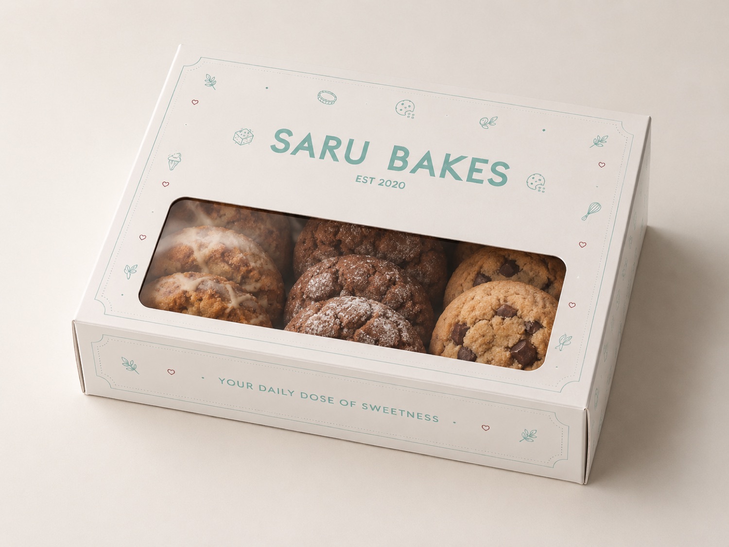
The window box lets the bake show through while staying unmistakably branded — framed by the bakery-icon pattern and a conversational, Instagram-friendly line. It set the tone for a system that turns everyday bakes into something worth photographing and gifting.
Classic Box
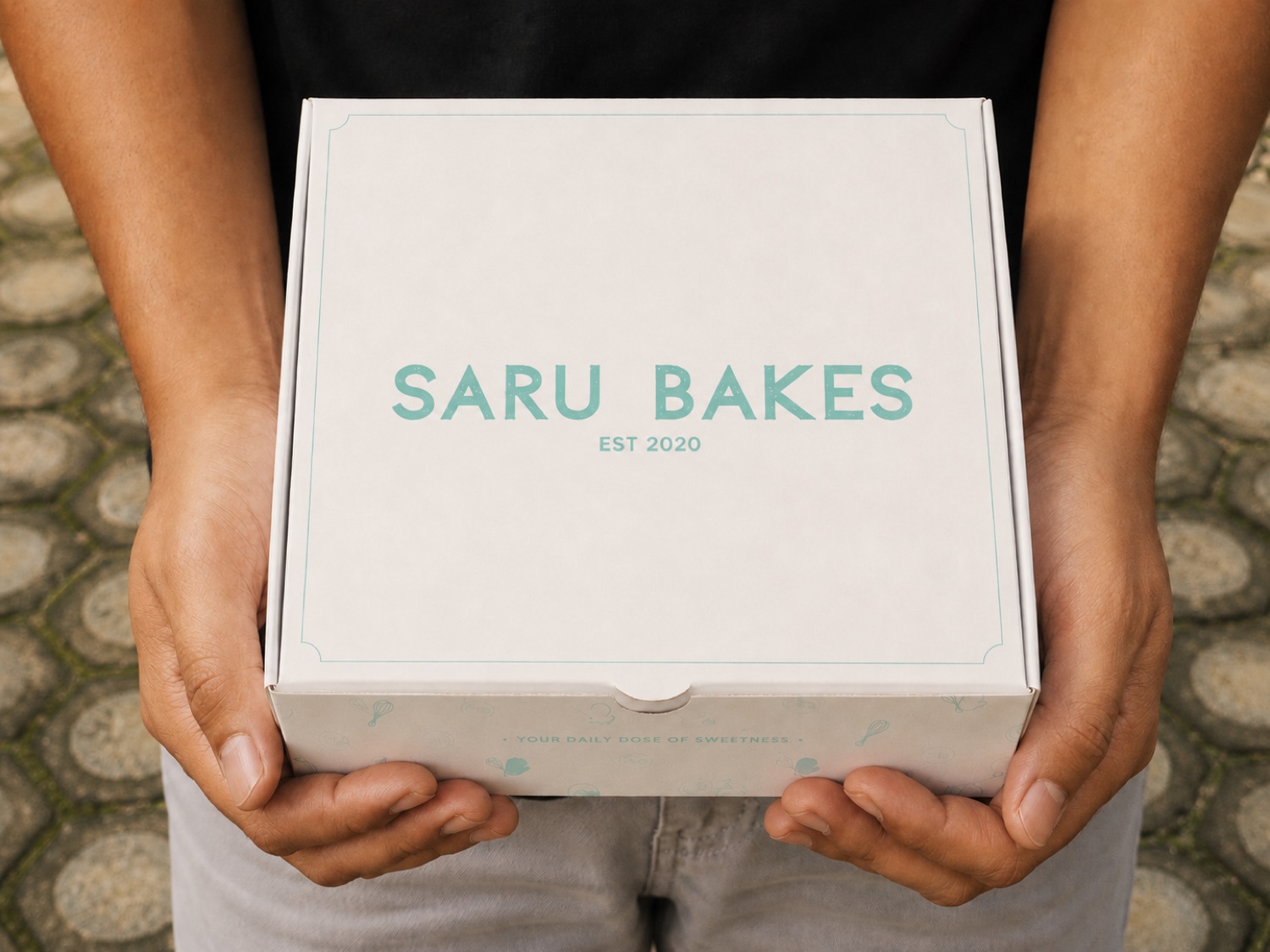
A clean bakery box with the logo front and centre in cream and mint, with subtle illustrated bakery icons — for cookies, brownies, pastries, and assorted bakes.
Window Box
A playful, product-forward box that lets the bake show through, with a conversational, Instagram-friendly line: “Omg, you look sweet!”
Tin Box
A reusable tin for premium gifting — collectible, festive, and limited-edition ready, well beyond the basic bakery box.
Cookie Jar
A glass jar concept for a home-style premium line — built for gifting, pantry display, and repeat-use value.
Butter Paper
Redesigned as a soft, minimal wrap: scattered bakery icons, small brand marks, and generous negative space for delicate items.
Bags & Gift Boxes
Paper bags, takeaway boxes, and gift boxes on the same palette, icon system, and logo treatment — consistent from delivery to gifting.
Menu Direction
The menu matches the identity — the same mint, burgundy, and cream palette, a clear type hierarchy, soft bakery illustrations, and warm, conversational copy across cookies, brownies, cakes, cinnamon rolls, gifting boxes, and seasonal specials. Not just a product list — a branded communication tool.
Pattern & Icon System
A custom pattern of bakery icons — cookies, brownies, tarts, whisks, oven mitts, cupcakes — built to flex across packaging, wrappers, menus, stickers, and merch. Refined to keep only the marks that felt true to the bakery, giving the brand a more ownable, recognizable language.
Beyond the Box
How the identity expands from packaging into lifestyle, gifting, and loyalty.
Collectible Packaging
Special boxes, tins, and seasonal packaging that customers keep or reuse.
Merchandise
Branded caps, keychains, stickers, and small accessories as fun brand touchpoints.
Loyalty Cards
A branded loyalty card to encourage repeat purchases and build relationships.
Seasonal & Limited-Edition
Festive boxes, collab packaging, and limited-edition gift sets for special occasions.
Branded Accessories
Tray liners, sticker seals, and gift tags so even the smallest touchpoint feels intentional.
The Positioning Shift
Where the rebrand moved the brand — before → after.
Final Brand Direction
Warm, joyful, premium, and highly brandable — a bakery that isn’t only about taste, but about presentation, gifting, and emotional connection. Every touchpoint should make the customer feel they’re receiving something thoughtful, sweet, and memorable.
Skills Demonstrated
Impact
Repositioned the brand from “homemade bakery” to “premium homemade bakery brand” — from basic packaging to a branded packaging experience, and from a product-focused seller to a lifestyle and emotionally driven bakery brand.